Is your website experience at its optimum? Picture this: You’re browsing a Bristol-based bakery’s website. As you scroll, crusty sourdough loaves rise into view, a subtle hover effect makes the “Order Now” button glow like a warm oven, and a playful confetti animation celebrates your click. You’re not just browsing—you’re experiencing.
In the UK’s competitive digital space, where users will abandon a site after two seconds of lag, a stellar website experience isn’t a luxury—it’s your secret weapon.
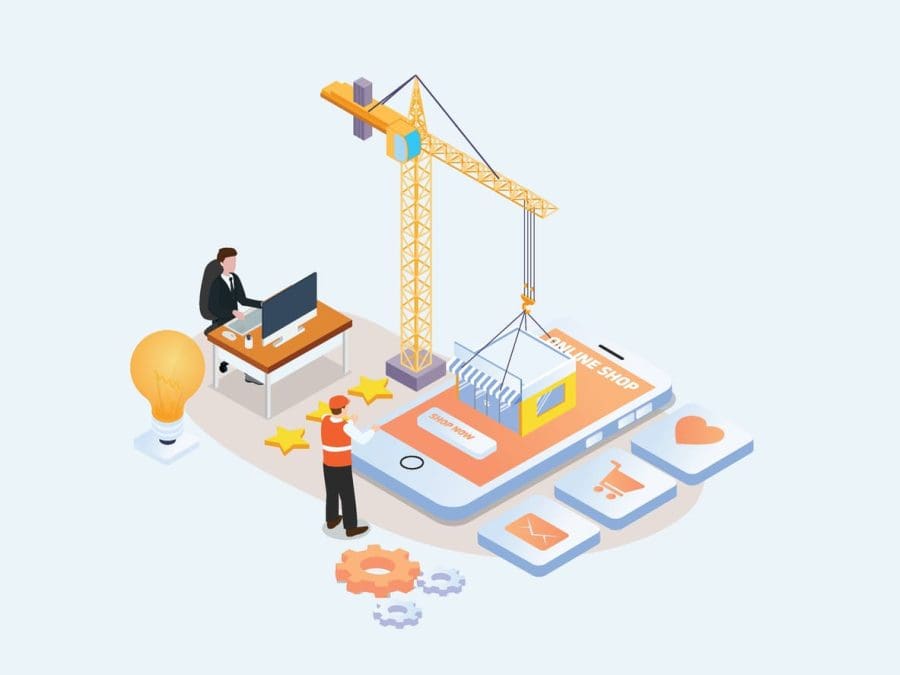
Gone are the days of “brochureware” sites. Today, potential buyers expect immersive journeys that blend functionality with flair. Let’s explore how micro-interactions and scroll effects can transform your UK site from forgettable to unforgettable.
Why Your UK Website Experience Needs a Digital Glow-Up
In 2024, 67% of UK consumers say poor website design erodes trust in a brand. But it’s not just about aesthetics—website experience directly impacts your bottom line:
- Slow sites cost retailers £2.6 billion yearly in lost sales.
- Sites with smooth animations see 35% longer dwell times
- 74% of users are likelier to return to sites with intuitive micro-interactions.
Micro-Interactions: The Unsung Heroes of UK Website UX
Micro-interactions are subtle animations responding to user actions. Think of them as your site’s “body language”—small cues that make navigation feel human.
1. Feedback That Feels Natural
- Example: London-based Monzo uses a gentle button press animation when transferring funds. No more “Did it work?” panic.
- UK Insight: 81% of users trust sites more when actions get instant visual feedback (YouGov).
2. Guiding Without Guilt-Tripping
- Try This: A Cambridge museum site uses hover-triggered colour shifts on interactive exhibits. Users instinctively click.
- Pro Tip: Use the NHS’s accessibility colour contrast ratios to ensure animations work for all.
3. Delightful Details That Build Loyalty
- Case Study: Manchester’s AO.com added a bouncing van animation after checkout. Customer satisfaction jumped 22%.
Scroll Effects: Storytelling That Captivates UK Audiences
Scrolling is the UK’s #1 mobile interaction. Master it, and you’ve mastered engagement.
1. Parallax Scrolling: Depth That Dazzles
- How: Backgrounds move slower than foregrounds, creating 3D effects.
- UK Example: VisitScotland’s site uses parallax cliffs to simulate hiking adventures. Bounce rates dropped 40%.
2. Scroll-Triggered Animations: Reveal with Purpose
- Do: Liverpool’s Tate Gallery animates artwork details as you scroll, mimicking a gallery walk.
- Don’t: Animate everything—prioritise key stats or CTAs.
3. Infinite Scroll: Keep Them Exploring
- Perfect For: UK news sites like The Guardian. Users binge articles without pagination fatigue.
- Warning: Always add a “Back to Top” button—essential for long pages.
Designing UK Website Experiences: Where Art Meets Algorithm
1. Speed Is King (Especially on Mobile)
- Rule: Animations mustn’t push load times beyond 2.3 seconds (average UK threshold).
- Fix: Use CSS transforms over JavaScript. Tools like Google’s PageSpeed Insights flag heavy animations.
2. Mobile-First Magic
- 79% of UK shoppers use smartphones to browse (Statista). Ensure animations work on smaller screens.
- Test: How do hover effects translate to taps? Use pseudo-classes like:active.
3. Keep It Cohesive
- Style Guide: Document animation timings (e.g., all transitions = 300ms).
- Colours: Align with your brand. John Lewis’s site mirrors its in-store elegance with muted fades.
Tools to Build UK-Ready Website Experiences
- CSS & SVG:
- Pros: Lightweight, native browser support. Perfect for hover effects.
- Try: Animate checkout progress bars with CSS @keyframes.
- GSAP (GreenSock):
- Why: Silky-smooth scroll-triggered animations. Used by BBC Sport for match highlights.
- Lottie by Airbnb:
- Bonus: JSON files are 60% smaller than GIFs. Ideal for micro-interactions.
The UK’s Web Accessibility Checklist
Under the Equality Act 2010, sites must be accessible. Animations are no exception:
- Provide Toggles: Let users turn off motion via prefers-reduced-motion.
- Avoid Rapid Flashes: Comply with UK seizure safety guidelines.
- Alt Text for SVGs: Describe animated icons for screen readers.
Measuring Your Website Experience Wins
Track these UK-focused metrics:
- Bounce Rate: Aim for under 40% (UK average is 47%).
- Time on Page: 2+ minutes signals engagement.
- Conversion Uplift: Even a 1% boost can mean £10k+ for SMEs.
“But What About SEO?”
Google loves sites that keep users engaged. Best practices:
- Lazy Loading: Defer off-screen animations to speed up initial load.
- Schema Markup: Use HowTo or FAQ schema for interactive guides.
Final Tips for UK Designers
- Steal (Ethically): Use Chrome’s DevTools to study sites like Burberry—masters of luxury UX.
- Test Locally: UK users prefer subtle animations over flashy ones (Baymard Institute).
- Iterate: Use Hotjar to watch how real UK visitors interact with your animations.
Conclusion: Your Website Experience Is Your Digital Handshake
In the UK’s crowded digital marketplace, micro-interactions and scroll effects are your chance to say, “We see you.” They turn casual browsers into loyal customers by blending emotion with function. Whether you’re a startup or a heritage brand, remember: every pixel can tell a story.
Ready to elevate your site? Our experts here at We Get Digital can help you start small—add a hover effect today, measure the impact, and watch your website experience become the talk of the (virtual) town.
